
Modifying Your Graphs
General Graph Modification Guidelines
EZAnalyze includes some simple graphing functions to help get you started creating your own graphs. For detailed information on modifying how your graphs look, you should turn to the help documentation that is included in Excel. You can find this information by going to the HELP menu of Excel (Should be located next to the EZAnalyze menu) and looking in the Table of Contents for "charts and graphics."
To get you started, however, here is a brief overview of how you can make your charts and graphs look better!
First, you should know that the "Chart" and "Data" in the sheet containing your results report, created when you clicked OK, work together. To illustrate how you can make changes to your chart, we will use the following example of a pie chart of a variable named "grade" that contains three categories - sixth grade, seventh grade, and eigth grade. The same principles apply for modifying bar charts and area charts.
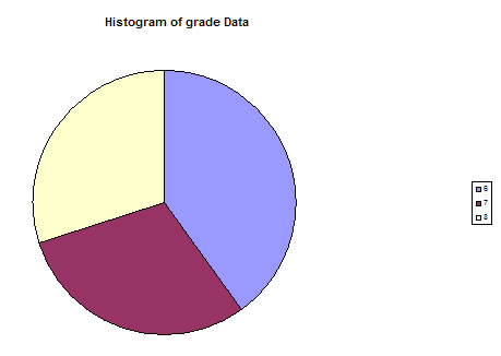
Example of a histogram, unmodified.
As you can see from the example above, our histogram is not very pretty. Let's do some work to make it more appealing!
Changing
your legend. You can change the legend by altering the data
that was created with the chart. For the above example, it looks like
this:
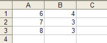
Column A contains our grade levels - 6, 7, and 8, and column B contains the
number of students in each grade. We can replace the numbers in column A with
words to have our legend make more sense.
Next, we will return back to the "Chart" that contains our graph by clicking on it. It is difficult to see what the percent of students in each grade is without numbers.
To add numbers, go to the CHART menu near the top of your screen and click on OPTIONS. In the "Chart Options" dialogue box, click on the tab that says "Data Labels" and place check marks in the boxes next to "Category Name", "Percentage", and "Legend Key". DO NOT CLICK OK YET!
Next, we should give our pie graph a better name. In the "Chart Options" dialogue box, click on the tab that says "Titles." In the "Chart Title" box, erase the text that is there and give our graph a better name - here, we will type in "Middle School Grade Level Distribution." DO NOT CLICK OK YET!
Next, click on the "Legend" tab in the chart options box and choose
a different place to put the legend. Now click OK!
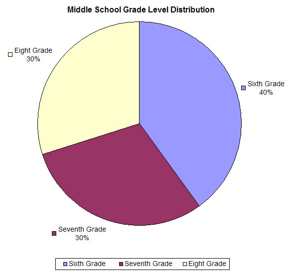
Voila! Our new, much prettier graph!
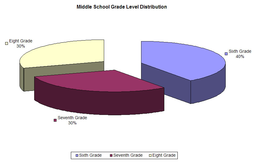
Want to add a 3-D effect? Go back into the CHART menu and select CHART TYPE. You will be given several 3-D options. Below is the "Exploded pie with 3-D visual effect" option.
Bar and Area Graph titles. EZAnalyze uses your variable names as the X and Y axis titles by default. Often, you will want to change these! To set meaningful titles on your bar graph, click once anywhere on your graph, go into the CHART menu and select CHART OPTIONS. On the "Titles" tab, type a new title for your categorical variable in the "Category (X) Axis" box and a new title for your dependent variable in the "Value (Y) Axis" box if you like.
Your are encouraged to "play around" with these chart options. If you mess something up, you can always go back to your original data sheet and create a new graph from scratch. You can also get to many of the graphing options by simply double-clicking on the area you would like to modify - give it a try!